They say first impressions are everything. Well, it's as true for your startup as is it for anything else. If users don't have a great experience the first time they use your product, it's likely they won't stick around for long.
When users don't stick around, it's bad for business. For starters, it's harder to convert a user who has tried your product in the past and decided against it than it is to convert a user who is trying your product for the first time. Secondly, people who try your product and decide they don't like it tend to become detractors and say things like "we tried their product but their UI was too confusing to get started" to other potential customers.
So giving users a great experience the first time they use your product is actually really important. In web startup lingo, we refer to the process of converting new signups into consistent users as user onboarding. It's a combination of demonstrating value, educating users how to use your product, and then guiding them through using the product for the first time.
Onboarding Is About Getting Users To The "Aha" Moment
Another piece of lingo: the "aha" moment. This is that moment where the users say to themselves, "Aha! This is why I would want to use this". The main goal of your user onboarding flow is to get users to the "aha" moment. At this point (in theory), they will either "get it" and are on their way to becoming a consistent user, or they just don't need whatever it is you're offering.
So what is keeping new sign ups from reaching your product's "aha" moment? Friction. Friction in the form of not believing your product is the right one to solve their problem. Friction in the form of not understanding how your product will make their lives better. Friction in the form of not knowing how to properly use your product. A company with a good onboarding process has removed these points of friction, and new users consistently reach the "aha" moment.
Our Toolbox For Reducing Onboarding Friction
There are many different tips, tricks, UI flows, etc, to remove the friction that causes your users to not reach your "Aha" moment. Here are a few that work well for us.
Usability Testing
The single most valuable thing you can do is 5-8 rounds of good old-fashioned usability testing. Find a few potential customers, stand behind them, and watch them use your product for the first time. It will uncover so many problems with your product that you didn't know about.
This one isn't really a tool in the same way the other ones are. Usability testing is more of a way to uncover when and where you need to add some of the onboarding tools in the following sections.
If you haven't or aren't occasionally doing usability testing, stop making excuses and do it. The benefits and methods of usability testing are well-documented so I won't replicate them here. If your curious about more info on usability testing, here's a good place to start.
Setup "Wizard"
If your web app requires more than a few minutes of setup, I suggest using a wizard of some sort. I know they aren't sexy, but in my experience they're pretty damn effective.
When people sign up for StatusPage.io, there are handful of things people need to do: give us basic some information about their company, tell us what each of the individual "components" are that make up their product, invite their team, customize their page, and backfill any incidents they've had in the past. If we just dumped new signups onto the Dashboard page right after they signed up, they would need to poke around the interface to find all of these things. Many of them wouldn't even realize some of the functionality we guide them through in the setup wizard even exists -- they'd feel like their page was missing important information and our conversion rate would suffer because of it.
Having a setup wizard allows us to quickly get users from sign up to the "aha" moment in a way that's easy to understand.
Image may be NSFW.
Clik here to view.
Good Use Of Knowledge Base
Making good use of a knowledge base is not easy. In my experience, many companies have a knowledge base filled with great content, but they aren't making good use of it. Unfortunately, when users have a problem, they rarely check to see if a knowledge base exists...let alone search through that knowledge base to find the answer they're looking for. As a result, all of this detailed, helpful content is going unused. The way to get around this is to surface specific knowledge base articles when the user is most likely to need them.
We recently implemented a system that surfaces knowledge base articles relevant to the page that the user is on (e.g. we have links to knowledge base articles related to Incidents when the user is on the Incidents page in our webapp). It's subtle enough that it doesn't get in the way if the user knows what they're doing. At the same time, it's easily-accessible and can provide relevant help when it's needed. After launching this context-relevant help widget, we saw a decrease in support tickets and small bump in activation rate.
Image may be NSFW.
Clik here to view.
Better Empty States
When using a new SaaS tool, I occasionally come across pages that consist of The Empty Table. You've probably seen this before and know what I'm talking about. Image: you've just signed up for some new SaaS tool and are setting things up but you haven't created any widgets yet. When you navigate to that Widgets page, all you see is a big empty table.
As a new user, this is a pretty bad experience. The Empty Table is a wasted opportunity to delight or educate the users in some way.
Instead of presenting users with The Empty Table, a better screen might do a few things: tell me when/how to use it, show me what it looks like when it's being used correctly, do a bit of "selling" by reiterating the benefits of using the feature, educating the user about, have a few pre-made examples of it in use.
At StatusPage.io, we do a mixture of pre-made examples and telling users when/how to use it.
Image may be NSFW.
Clik here to view. Image may be NSFW.
Clik here to view.
Near 24/7 live chat
One of the joys of being a five person team is that everyone does support. It may seem like a distraction at times, but keeping the builders and decision makers close to the customers is extremely beneficial. We use Olark so that if any of our new users have a problem, they can get an answer from us immediately over live-chat. We get most of our new customers via word-of-mouth, a lot of which we attribute to great customer service.
We recently did a huge post on Founder Support so read that if you haven't yet.
Don't Treat All Users The Same
Many SaaS companies treat every new signup the same. They go into the same drip campaign, get the same emails, and receive the same level of support. Communications should be personalized to the user because some users need a higher level of handholding than others. And it makes sense if you think about it. Image the following scenario:
After careful consideration, Alice signs up for your service. During the setup process, she invites her co-worker Bob. You now have two users for one account that need drastically different levels of help. Bob is going to need a lot more help than Alice. Over the passed few days, Alice has research the problem, seen screenshots of your webapp, and has compared the features of several competitors. Meanwhile, Bob just got an email out of the blue notifying him about this new tool the company is using.
In order to help give the Bobs of StatusPage.io more context around what our company is about and how our product works, we include a quick intro video in the welcome email that goes out to people who were invited by someone else to join an account.
Image may be NSFW.
Clik here to view.
Design For The Novice, Configure For The Pro
If you've ever worked at an early stage startup, this will be familiar to you. You probably started with a nice, simple app that did one thing really well. Right after launch, the feature requests started rolling in. So you added a few small features, a couple options, nothing too big. But over the course of a year, it all started to add up. Your once-simple app went from dead-simple to kind of confusing. Over time, all of the features, options, and integrations made your webapp hard to use.
We experienced the same exact thing at StatusPage.io. In an effort to give our new signups the simple, streamlined, experience we used to have, we launched an Add-on Store. When new users sign up, the only features they see are those that make up what we consider to be the core product offering. All of the extra feature additions and integrations are available in the Add-on Store for more experienced users to activate.
Image may be NSFW.
Clik here to view.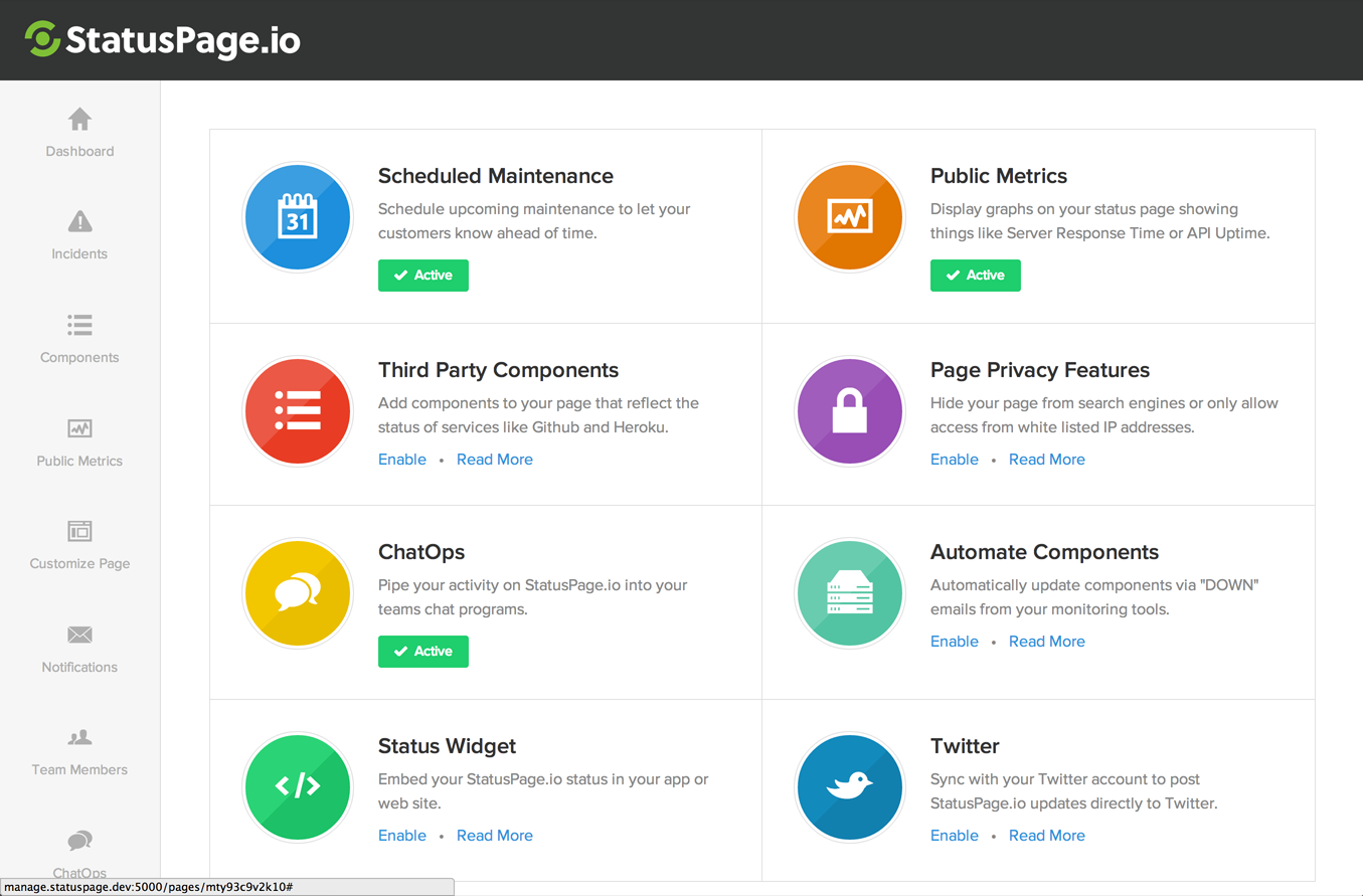
What You Should Take Away From This Post
- I can't recommend doing live usability testing heavily enough. Seriously. Do it.
- Remember that a good onboarding experience will depend on the specifics of your product. Not all of the tools in our onboarding toolbox will make sense for you -- but if you're a B2B webapp, most of them will.
- We focus a lot on our user onboarding, and 12% of our signups convert to paid accounts (which is pretty stellar). You can achieve the same results, but it's going to take some time to work out the right way to introduce new signups to your product.
Onboarding Is Just The Start
Onboarding is extremely important but remember...it's just the "first date". You have the whole relationship ahead of you! In the future, we'll talk about Retention, Customer Success, and Churn. Subscribe below if you're interested!